Recently we’ve been experimenting with a prototype feature that we think might make it easier for streamers to set-up their transitions and switch between scenes when live.
For those of you with Meld Studio installed this will have just been rolled out as an experimental feature in the latest release (0.5.0.0). But we also want to get some feedback from the wider community both on our new approach but also on the existing UX patterns for scene switching and transitions.
How Scene Transitions Work Today
One Transition to Rule Them all
Meld Studio has had basic support for scene transitions since version 0.2.6 and you have always been able to switch between scenes via the scenes list in the bottom left.
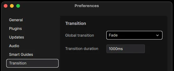
For many beginning streamers or just streamers with a few simple scenes this works great! You can set-up your “intro” scene, add a basic “Just chatting” scene with a camera and screen share and then round everything off with a “Exit” scene to show when your done. Then adding a global “Fade” or “Cut” transition will apply to all of your scenes and your good to go! Right?
Transition Overrides
Well sometimes a single global transition for all scenes just doesn’t cut it. What if you want to use a “Fade” transition when moving from your “Intro” scene to your main “Just Chatting” scene but then want to use a “Cut” transition for your “Stream Over” scene?
That’s where transition overrides come into the picture. These work differently between different software but the basic concept is the same throughout. Let the user set specific transition settings when moving from “Scene A” to “Scene B” and fall back to the global transition settings if no overrides are set. It sounds simple enough but designing a user interface to manage all of the overrides you might end up with can quickly get tricky. To see why take a look at the below example which illustrates all of the permutations possible for a simple project with three scenes laid out in a matrix table.
Matrix Layout – Transition Overrides
| From Scene / To Scene | Intro | Just Chatting | Stream Over |
| Intro | – | Fade | ? |
| Just Chatting | ? | – | Cut |
| Stream Over | ? | ? | – |
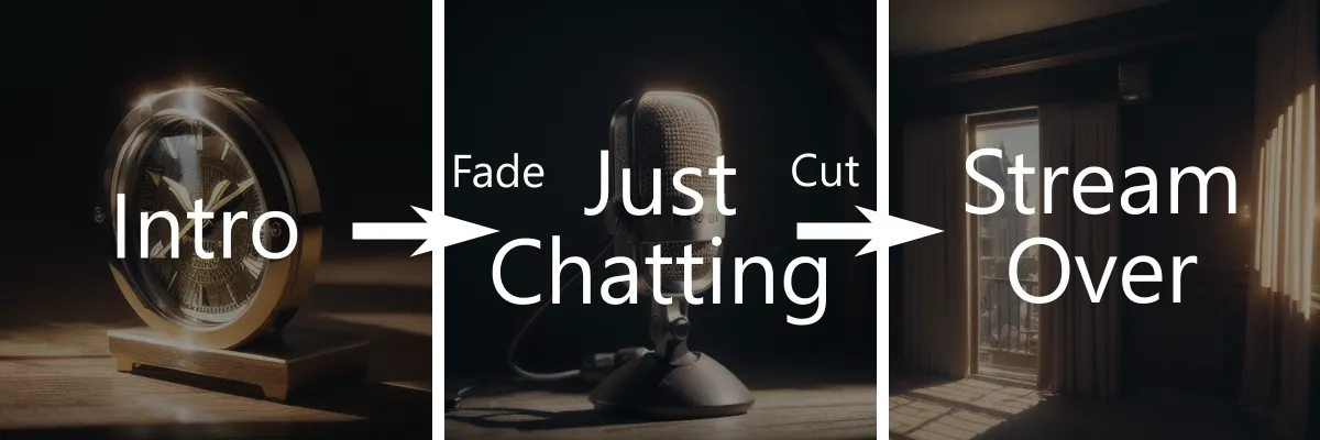
Since we only have three scenes and only care about two transitions (the “Fade” transition from “Intro” to “Just Chatting” and the “Cut” transition from “Just Chatting” to “Stream Over”) it actually works out ok. The “?” values can symbolise transitions that have not had their settings overridden and will just use the global transition. However, as you may know from experience yourself, streamers may have many more scenes in practice. Take a look at how this table starts to look with just 10 scenes.
| From / To | Intro | Main | End | Break | Vr | Game | Poll | Webcam | XBox | Misc |
| Intro | – | Fade | Cut | Fade | Fade | Fade | Fade | Fade | Fade | Fade |
| Main | ? | – | Cut | ? | ? | ? | ? | Morph | ? | ? |
| End | ? | ? | – | ? | ? | ? | ? | ? | ? | ? |
| Break | ? | ? | Cut | – | ? | ? | ? | ? | ? | ? |
| Vr | ? | ? | Cut | ? | – | ? | ? | ? | ? | ? |
| Game | ? | ? | Cut | ? | ? | – | ? | ? | ? | ? |
| Poll | ? | ? | Cut | ? | ? | ? | – | ? | ? | ? |
| Webcam | ? | ? | Cut | ? | ? | ? | ? | – | ? | ? |
| XBox | ? | ? | Cut | ? | ? | ? | ? | ? | – | ? |
| Misc | ? | ? | Cut | ? | ? | ? | ? | ? | ? | – |
Now imagine your a professional studio with hundreds of scenes scenes and you can see how this matrix layout quickly gets out of hand.
This is not even taking into account that transitions generally have other properties associated with them than just a “type”. You may want to change the transition duration, or different transitions types may have different properties of their own (Meld’s morph transition has a strength property for example). You may even have some scenes that should only ever be transitioned to from specific other scenes. Integrating all of this information into a matrix starts to become impractical, fortunately there is another common UI pattern to work around this, the “Transition Table”.
Table Layout – Transition Overrides
Most of the entries in our 10 by 10 matrix example are empty and all of the diagonal values will always be redundant. What if we just showed the specific transition override rules that we have added in a single list instead?
| From | To | Type | Duration | Strength | Enabled |
|---|---|---|---|---|---|
| Any | Stream Over | Cut | – | – | ✔ |
| Intro | Any | Fade | 1000ms | – | ✔ |
| Just Chatting | WebCam | Morph | 200ms | 0.5 | ✔ |
Much nicer! Now this gives us a view where we can see everything that is going on and anything that does not match one of these rules will fallback to the global default. We can even specify “Any” for the “From” or “To” properties to cut down on have to make a bunch of duplicate rules.
However there are still problems here:
- Not all transitions have all properties. A Cut transition does not have a duration and only the Morph transition has a strength property. Some transition types may have many sub properties and a table column does not always present the best UX for editing a value.
- If I am currently on scene “XBox” and I want to transition to “Break” which transition will be applied? We only have three rules here but what happens when we have hundreds? In cases like these this view does not help the user work out what is actually going to happen.
- What do these transitions actually look like? A table provides no way to preview the transition it defines.
Not wanting to back away from a challenge, we set ourselves the task of prototyping up some new ways of controlling these overrides. We wanted a control that gives us all the benefits of the table view if possible but without any of the UX issues mentioned above.
Our Proposal – The “Radial Scene Switcher”
The glaring issue with a table view is that it provides a poor way to show connections between scenes. We thought what if we could show the transitions themselves in something closer to what you would see in a node editor?
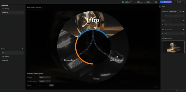
After some internal prototyping one design we arrived at was a radial scene switching control which visually shows the transitions from your current scene.
The benefits of a design like this are:
- You have access to all your scenes in one view, no need to go scrolling through tables or lists if you have many scenes
- You can see all of the transitions from your current scene to any other scene without the transition paths overlapping scenes like they might do in a grid view.
- This view gives us much more real-estate to visually show properties of a transitions. For example we can make the dots moving along the transition paths move faster if the transition duration will be smaller.
Lets see how it stands up to our original example of a project with three scenes and two override transitions. Before that though, we first need to take a quick aside to explain another concept that we have introduced. “Staged Scenes”.
Staged Scenes
When defining a transition between two scenes you need to have a way to define the “current scene” and the “new scene”. Meld Studio already has a current scene, it is just what your viewers see when your live. However a “staged scene” is another scene that you may want to transition to but aren’t quite ready to show your viewers.
In some other live streaming tools you are able to open two scenes side by side while live so that you can make edits to one scene without letting your viewers see what your doing. Think of “staged scenes” as a step towards this kind of functionality for Meld Studio.
With the radial scene switcher you can now stage a scene for transition by selecting a destination scene in pane to the left, selecting a “transition to” scene in the property editor for your selected scene or just middle clicking on the scene you want to stage.
The orange indicator highlights the “staged scene” in the gif above. Not shown here but also useful is that by pressing space the current scene and the staged scene will swap.
Adding a Transition
Now that we have seen how to “stage” a scene lets see how to set-up a custom override transition between two scenes. There are actually multiple ways to do this but the simplest and easiest to understand is to use a direct Scene A to Scene B transition override.
These can be done by staging a destination scene and then checking the enable switch to the side of the combo box. Then you can select a custom transition just like in the global transition settings by choosing the transition type you want and modifying it’s settings (if it has any). In our case we’ll set a “Fade” transition between our “Intro” and “Just Chatting” scenes.
Notice how the dots moving along the transition path move faster after adding the override transition? That’s because the global transition has a duration of 3000ms (See settings in bottom corner of above image) but the new “Fade” override transition only has a duration of 1000ms. If you set a cut transition or set the duration to 0ms then then path will flash instead to indicate that the transition will be instant.
Default Enter Transitions
Sometimes you might not want to manually override all possible transition paths in your project. This was one of the big benefits to the table view approach with it’s support for “Any”. We can do the same thing here as well though by utilizing a default enter transition. By setting the “default enter transition” properties for a scene you can make it so that any transition into that particular scene will use that transition.
Any transition path that will use a default enter transition will show as green in the scene switcher to differentiate it from a global or a direct transition.
Default Exit Transitions
Default exit transitions are the same as default enter except they apply, like you might expect, when your transitioning away from a scene. They will show up as a pink path.
Transition Precedence
It is important to note that if you have one scene with a “default enter transition” and another scene with a “default exit transition” then the “default enter transition” will take precedence. A direct transitions will take precedence over all other transition types as they are the most specific.
Blocking Transitions
A particularly powerful feature that drops out of all of this is the concept of transition “blocking”. By enabling “Blocked” on a transition the scene switcher will prevent you from accidentally transitioning between scenes that would otherwise use that transition. You can set the blocked flag on direct and default transitions. Any blocked transition will also not show in the scene switcher making it easy to see all valid transitions from the current scene.
Lets block the transition from “Intro” to “Stream Over” as an example:
By holding “command” you can still force a transition that’s blocked to switch. But without that you’ll be restricted to moving between scenes that you have not blocked.
Scene Preview Images
The final addition that this control brings is the ability to add preview images for scenes. These previews show up in the scene switcher to make it easier to recognise a scene at a glance. In the future we may support automatically generated previews based on the scene contents but even then a simple static preview is often useful. These may also give us something to show in our stream deck plug-in other than just the scene name.
Putting it all together
Three scenes is easy to handle but what about something a little more challenging?
What if, for example, you wanted to re-create a world from Pokémon as a set of scenes with all of the routes matching up and transitions set-up to match the game? Well now you can! Though that doesn’t mean you should….
Above you can see a small part of the Sinnoh region from Pokémon Diamond and Pearl recreated as a set of scenes. It may not be the whole map but it demonstrate the power of this approach.
Share Your Feedback
We are always blown away by what our users manage to create with our tools and we’re really looking forward to see how this one in particular gets put to use.
This is still an experimental feature but we’d love to hear feedback from streamers to see what they make of it. Does this enable you to build the viewing experiences that your aiming for? If not what are they and what would you want to see from Meld to make them possible?
We have a discord channel if you want to follow along with updates like these or give your feedback to us directly. Or simply comment on any of our social media and we’ll make sure to get back to you. Experimental features like these often come out of requests we hear from our user base so it really does make a difference when users take the time to reach out.
We also have many ideas internally for how to extend Meld Studio’s transition support going into the future. While this new update focuses on transitions between scenes what if you want to animate layers within scenes after specific events ( viewer subbed, on finished transition, on stream deck button event, etc )? How about defining transitions for Audio devices? Or maybe you don’t care about fancy interfaces and just want a scripting environment to write your own logic? These are all things we are thinking about at Meld but if you think we are missing a trick or simply think that we’re not prioritizing the features you would want to see then let us know! We’re always open to new ideas.
How to access experimental features
Finally, if your looking to try out this feature in the latest release but don’t know where to find it, this is where to look. If you press and hold on top of the Meld icon in the bottom right corner for a few seconds you should see an experimental features popup appear where you can enable this feature.
Then just focus the canvas and press tab to open the radial scene switcher. Enjoy!

